PayPal Redesign @webbruce
Can you believe the PayPal dashboard doesn’t give you the information you need quickly and efficiently? Good luck searching for a transaction four months ago to make sure a client paid for his delivered work or having a non-tech user understand all the options to tweak their account. PayPal processed around $14 billion in transactions last year and you would think a modern, usable dashboard would be necessary to help grow that total. This is why I researched, wireframed and designed a new dashboard for PayPal users to enjoy.
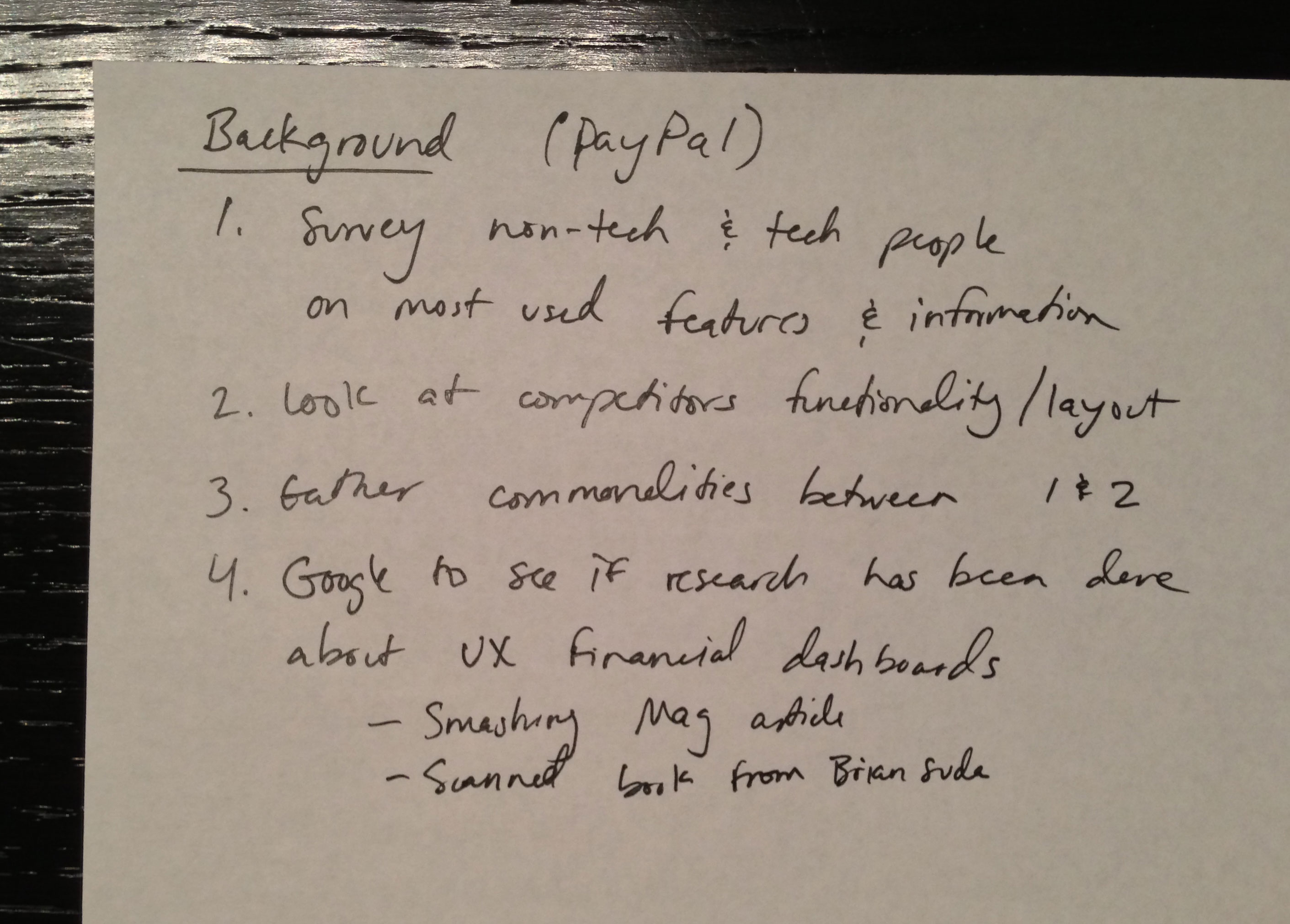
I first created a plan to attack this project. While writing down a few steps, I also knew that I wanted to interview a few non-tech PayPal users on their most used features.
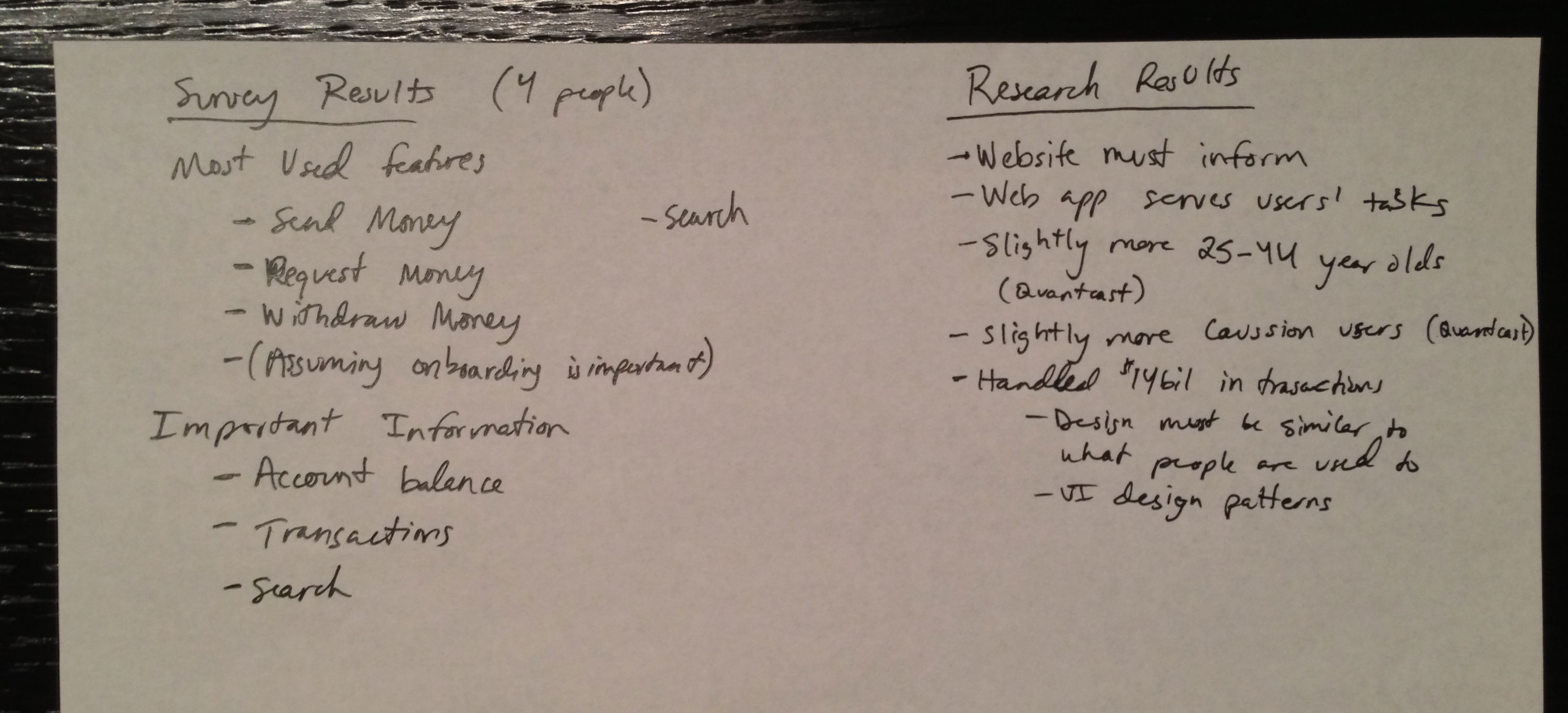
I found an interesting article about the UX of business-focused web applications, which lead me to identifying my audience through Quantcast. Through the interview process, I asked frequent users what information and features they found most useful in PayPal. I also asked what new features/information they’d like to see, but that didn’t return any results from my four participants.

I printed out my PayPal dashboard to able to start removing features of PayPal. I wanted any buttons that were not frequently used (according to my interviewees) to be hidden in a dropdown menu or other submenus. This step helped organize my thoughts for a few wireframes and made me think about responsive characteristics, retina images, UI patterns, icons and more. You can almost think of this step as a “mobile first” strategy to hide any features that wouldn’t be on a mobile view of PayPal.

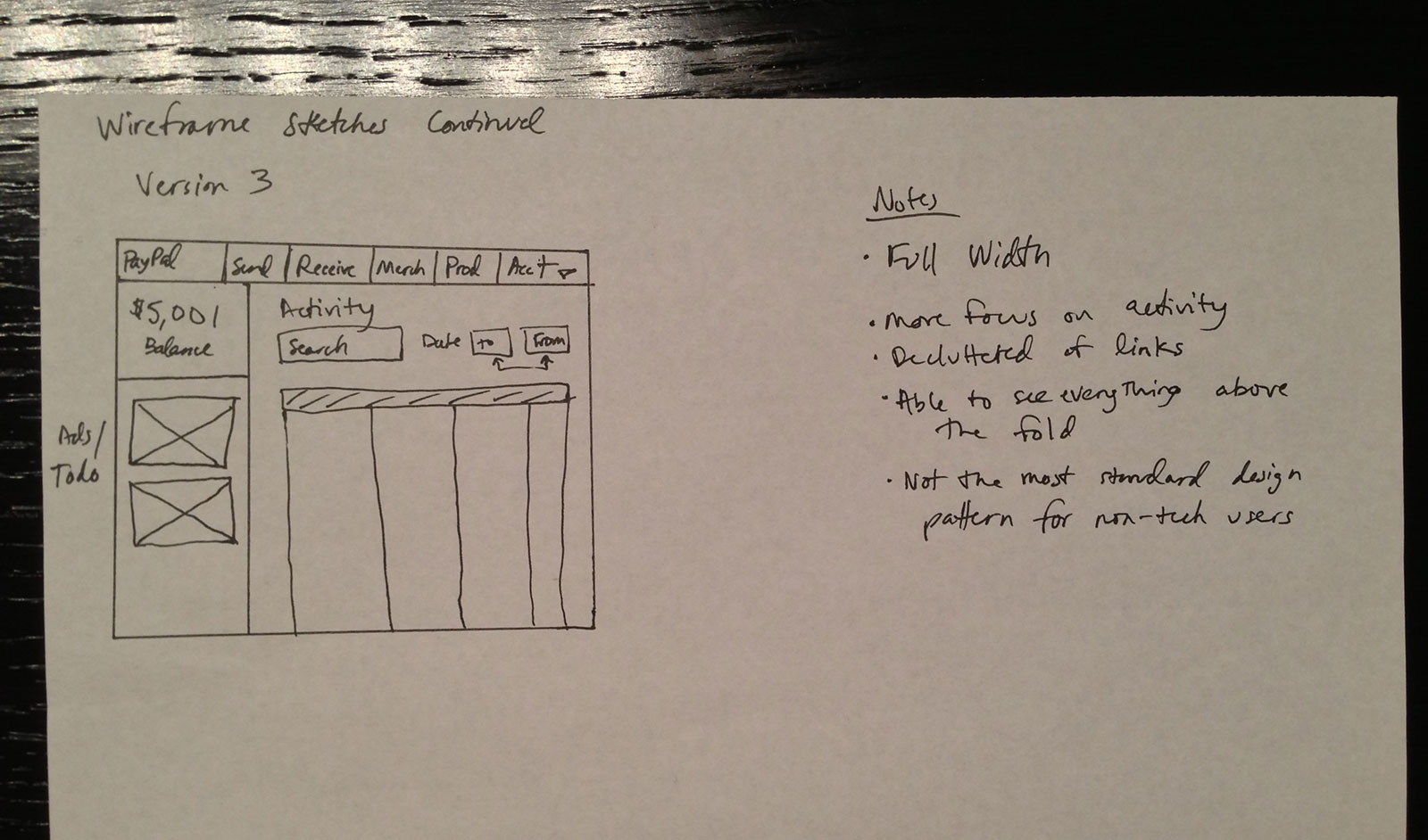
Next was the wireframing stage. I found a few great UI patterns on Google that I could use in sketching out a dashboard. I created a few options based on modern design/layout trends, importance of the information at hand and frequency of the usage of each feature. On the side you can see notes about each sketch. I ended up choosing to use a lot of Version 2 because I felt it displayed important information prominently, improving usefulness of existing features and showed frequently used features clearly.

This is the final, retina design. It would be nice to have more time for polishing but I strongly believe it provides a much clearer view of the PayPal dashboard than what currently exists. At the top, you can quickly search for a transaction, view any notifications such as Payment Received or Information Needed, contact Help or tweak your settings. Your current balance is displayed clearly and quickly. Money saving tips was an idea I’d like to try since this could increase the amount of sign-ins a user has per month to view the tip of the day. According to my surveys, I added the four most used buttons to the sub-navigation and the main content area has your account activity. You can quickly filter by date and see all transactions with an endless scroll.